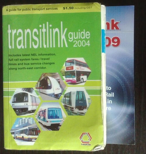
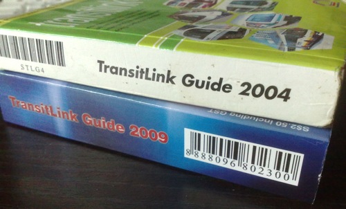
My TransitLink Guide 2004 has been with me on every single bus trip. My well-thumbed guide, with sections that have fallen out and now sometimes out-of-date, has even taken me to places I didn’t intend to go because of route changes. Which is okay, because I get to go to places I would not have, and discover things I wouldn’t have seen. That’s the joy of travel in a country I call home, but don’t know so well.
Now, four years on, I decided to upgrade to a shiny new TransitLink Guide 2009.
For years, the then Bus Guide, now TransitLink Guide has seen very little change in format. Today, for S$2.50 including GST, I’m now the owner of a copy of the hefty mini Yellow Pages of the public transportation system.
Is the new TransitLink guide an upgrade, a ho-hum side-grade or worse, a downgrade?
In a message to passengers, TransitLink states that the guide now incorporates Bus Stop Codes -Â numbers that have been given to every bus stop – and that, because of this information, “the new guide is now broader. The bigger book size ensures that the text size is not compromised and the thickness of the guide not substantially increased.”
Let’s look at the differences shall we?
The old guide
- 96mm (L) x 139mm (H) x 22mm (D)
- 288g
- S$1.50 including GST
The new guide
- 128mm (L) x 141mm (H) x 26mm (D)
- 476g
- S$2.50 including GST
In weight, the guide has increased by a whopping 65.3%.
In length, the guide has increased by 33.3%, the height by 1.4%, the thickness by 18.2%.
In price, the guide has increased by 66.7%.
What this means is the guide today
- is less portable
- is less manageable with one hand because of that broad shape
- uses more paper (no mention of whether recycled paper is used)
- adds 188g more weight to my backpack
Aren’t there any pros to this re-design?
Well, it makes my wallet lighter. Oh wait, that isn’t a good thing.
The guide is less useful because it can’t be with me all the time. It’s nearly half a kilo! I’d leave it at home, where it’ll be a reference, as meaningful as the phone book that no one collects from the post office anymore. I already carry laptop, notebook and other stuff in my bag, I need something reasonably light.
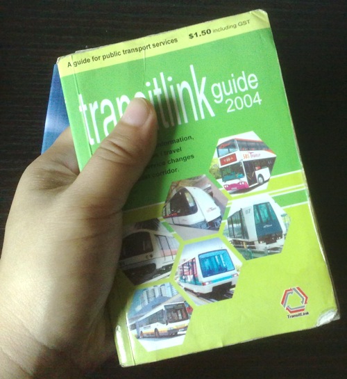
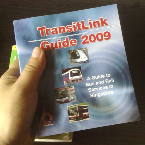
Here are the guides in my hand and you can see why I say one-handed operation of the book is harder.
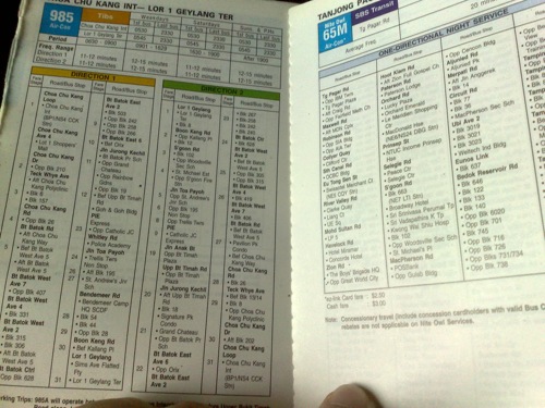
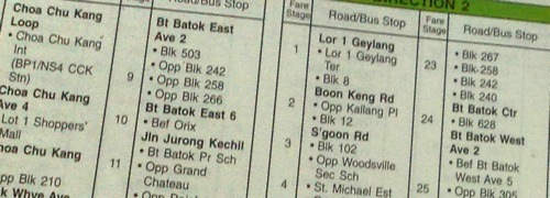
Looking inside, the addition of Bus Stop Codes has forced the addition of a column which is why, the guide is broader.
The questions that come to mind are
- Is the addition useful or worth it?
- Could other columns have been removed? (to retain size)
- Could some pages be eliminated? (to decrease weight)
Here’s a photo of what the old guide looked inside:
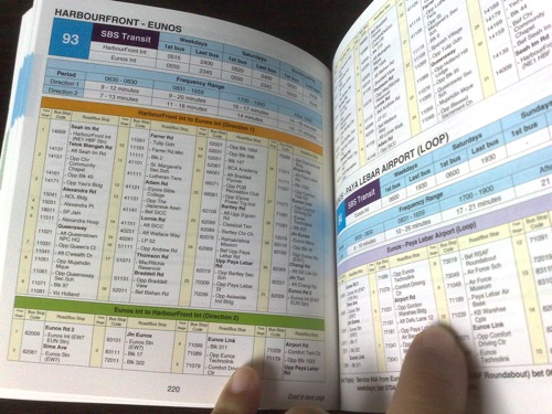
Here’s one of the guide today:
The new guide
- Adds a few more colours to the page
- Adds one column for the Bus Stop Code
- Places each direction in its own table, on top and below, rather than alongside each other.
- Adds more whitespace for a cleaner look
- Uses a wider fatter font.
Weighing the Pros and Cons
Are these improvements so beneficial that they are worth the gain in weight and size in our now fattened TransitLink Guide? I don’t think so.
The Bus Stop Code can be helpful, I suppose. Now, by comparing the codes at the bus stop to the one in the guide, you can tell if you’re on the right side of the road or not. However, it seems only useful when there’s no one at the bus stop, because you could just ask another commuter, or the next bus driver that comes along the way.
Also, the Bus Code Number sequence doesn’t really make sense to me. For example, on Telok Blangah Road, the numbers run 14131, 14151, 14161, 14171. Whatever happened to 14141? And then on Farrer Road, why does the 11xxx series suddenly become 41xxx?
The additional blue coloured cells for the headings clutter up the page, as does the yellow.
With the addition of the Bus Stop Code column, could we have eliminated the Fare Stage column? Right now, if you board at stage 2 and stop at stage 5, you will have travelled 3 stages. Why not put the bus stops in one stage in alternate colour blocks instead? So, let’s say Stage 1 is in yellow, Stage 2 in white, Stage 3 in yellow, Stage 4 in white and so on. It would simply be an easy counting exercise to get the number of stages.
Furthermore, are people really that concerned with fare stages any more? In the past the onus was on the commuter to get ready exact change for a bus trip, this has been made more or less redundant by the use of stored value cards. True, we should be able to double check that we’re not being overcharged for our trip and some still use cash to take buses. But it’s not that crucial. Still, colour blocks can replace that column for fare stages.
I don’t like the directions being separated into different tables. With the old system of having them run alongside, I could tell by a side by side comparison if the bus takes the same roads back and forth and working out if the road was one way or not along the route. But this is just a preference.
Now, besides the additional column, what takes up more space is the extra wide font that the TransitLink Guide 2009 uses.To give you an idea how much extra space the font takes, the word “Weekdays” is 8mm wide in the old guide, but is 10mm in the new guide. That 25% more space. “Clementi Ave 3” was 11mm, now 12.5mm, nearly 14% wider.
The wide font is also ugly. I’m not sure what font it is. San Serif. Maybe a geometric font, judging from the roundness of the “O”s. Yes, it’s modern, but is it suitable for a guide like this? Where space is a premium?
The old guide might have used… Arial. I don’t know. But it was good, clear, easy to read. Took up way less space. Which is the issue here.
If TransitLink wasn’t sure it was readable enough, they could’ve included one of those plastic magnifying bookmarks. I’d rather the weight of a detachable plastic item, than the weight of excess paper.
Speaking of excess paper, this is what TransitLink should have done with their guide. About 20 – 50 pages are filled with information – some repeated – of how to use your TransitLink card, how to tap on boarding, how to tap on exiting, the various concession passes, how to get your money back from them for expired cards, spoilt cards, info on lost cards, modes of payment, how to use the Add Value Machines, where to buy the tickets from etc etc etc. Information that you don’t need with you all the time. This should have been hived off as a separate booklet.
“Wait!” you exclaim, “Doesn’t this mean more binding, higher costs and so on?”
“Wait,” I patiently reply. “I haven’t finished.”
If you study the way the new TransitLink Guide 2009 has been bound, you will see it’s made of many mini-saddlestitched booklets that were then perfect bound together with glue and a cover.
Potentially, all that useful information could have been in one minibooklet that was left out of that final binding process. It could be sold together, at the same price. Those who are new to the whole public transportation system might have their minibooklet with them at first, until they get acquainted with the system. For those who already know the system, the minibooklet can be left at home for reference.
Of course there’s useful information that should be left in there, all the time. For example, locations of the Park and Ride car parks, places of interest, the road listings, the numbers of taxi companies and so on.
So, if TransitLink had
- Kept the old space-saving font.
- Eliminated the Fare Stage Column.
- A separate info booklet.
They could have kept the weight and size of the guide down. Perhaps even kept to it’s handy size of years before.
Oh dear me. It looks like the TransitLink Guide 2009 is a downgrade of hefty proportions.


