
I did.
Not what was inside, but what was outside.
They say don’t judge a book by it’s cover, but that’s exactly what I’ll do. Ang pows (red packets) that bear a company logo in the back deserve scrutinizing. The design of an ang pow is a form of advertisement, an image association for that particular company.
So, let’s take a look at the paltry collection I amassed these past two days.
First, those from the banks and investment companies.
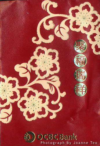
From Overseas Chinese Banking Corporation (now simply called OCBC), a very conservative design. Slightly modernised with simplicity. Very safe. Too safe. Stepping into plain boring. The impression created here doesn’t differ much from my experience with the bank.
Here’s Development Bank of Singapore with their whimsical design. But I really dislike the gold flowers. It doesn’t seem to be in keeping with the rest of the design. Seems to give it a rather cluttered feel to an already cluttered fabric of the girl. The fu character meaning luck is stamped on the poor girls’ cheek. I’m not particularly taken by this design, which is rather heavyhanded on the black. Not a good colour for new year, don’t you think?
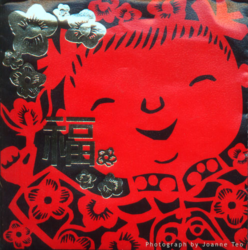
The design is half of that that appears on the DBS website. I’ve taken the liberty to add it here because DBS will update their website and we’ll have nothing to refer to.
I’m guessing there must be another ang pow design with the left half of the above image available. As a duo, the picture seems much less claustrophobic. Even though there is more black, it actually appears to be less prominent due to the two red faces. The Chinese character also has it’s own space.
The lateral design lends itself to an obvious change – and if DBS had capitalized on it, would be different and interesting – an ang pow that opens on along the long edge rather than the top edge. Now that would’ve been fun.
DBS’ ang pow disaster shows that you can’t chop up a design and hope that one half would make a complete whole.
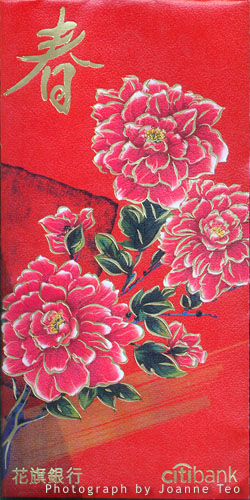
Here’s Citibank’s design. Again too safe. Very aunty, don’t you think?
Forget the red packet, it’s time to make a bold statement with a gold packet, that’s the opinion of investment management company Invesco. Nicely done. Even with $2 note in there, Invesco can turn it into gold for you.
I really like M1’s ang pow design. Cheeky and playful, totally in keeping with their sun shiny “One Life. Live it.” motto. This particular shade of gold is fabulous too.
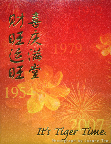
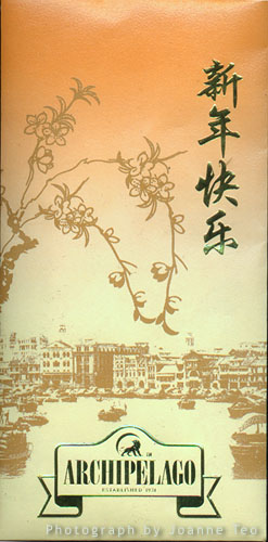
The next two are from Asia Pacific Breweries. The first is bears the Tiger Beer logo. The second is Archipelago Brewery Company which makes craft beers.
Tiger’s design with the years plays on their tag “It’s Tiger Time”. Could they be more literal?
Archipelago’s yellowed design hints of an era long past of craftsmen and tradition. It’s not a bad design. But surely the logo could be a little more discreet?
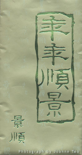
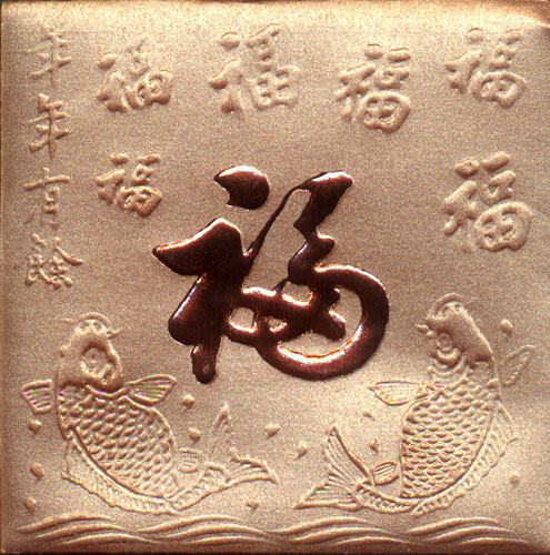
Here’s a generic one that I quite like the bronzy look of. Luck and prosperity all the way!
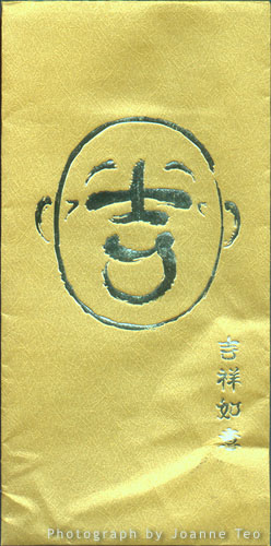
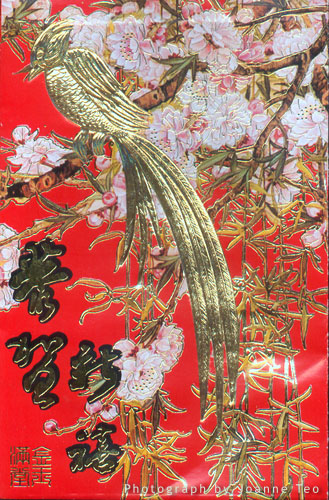
Here’s another that also bears no company name. Real noisy with all blossoms and phoenix (I think). It just screams “this is Chinese New Year and here is your ang pow! So just shut up and take the money!”
Happy New Year.