
It’s nice that the Singapore Government wants to make most of its services available online.
You can pay for fines and licenses online.
You can search for rules and policies on flat-buying online.
You can book your solemnization slot at the Registry of Marriages online.
It’s nice. It’s convenient.
But… yes there is always, unfortunately, a but… why can’t they do it right?
Have you noticed the number of pop-ups that government websites like to have? They’re almost as bad as sites with pop-up porno ads and not as visually interesting especially if you enjoy the curves of the human form over that of the English alphabet.
The CPF board has pop-ups galore. This, I discovered when I wanted to update my mailing address online. (You can’t.)
And today, I almost punched my monitor when I saw this:
IF? Who isn’t nowadays? It’s default on all good browsers.
I just wanted to do a payment for TV licence. I only do this once a year. For that I have to configure my browser to allow pop-ups from eNETS.
I disabled Firefox’s pop-up blocker temporarily while I was doing this payment.
I started with one window. By the time I had finished payment, I had seven windows open. Yup. Seven.
After that, I immediately re-enabled my pop-up blocker. I’m not going to add any sites for my pop-up blocker to ignore. No way. I don’t like pop-ups and if a site insists on putting important information on pop-ups, I don’t visit it in the future. It’s a turn off.
You can be sure, I’m not an E-NETS user. And this proliferation of windows popping up all over the place isn’t going to win them another customer.
It really galls me when I have to change my surfing habits to do something that I don’t like to do – in this case pay bills. To have to do unlikeable things in a troublesome way is damn frustrating!
On the bill notice that MDA sends, it asks you to go to https://mdaonline.mda.gov.sg That looks like just any web address, but notice the “s” at the end of the http? It indicates that the server is secure for you to make payments.
Unfortunately, if you are like me, a frequent web user, when we see web addresses, we just skim over the http part. Indeed, when you type in a web address, you don’t even have to type in http, which means most people, when reading a mailer will ignore that part of the address.
And so that’s what I did.
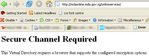
Oops. (I’m already being damn forgiving about the unwieldy address.)
I know what it means. Do you? Would my mom, if she had done this herself? Well over 60, who only e-mails and plays online sudoku, who still gets confused between a web address and an email address, whom I’d taught to not type in the http because it’s automatically done for you? (Also, the error message is actually incorrect, because my browser “supports the configured encryption options”.)
Is it too much to ask that MDA re-directs the user to the right https site if they should type a plain http?
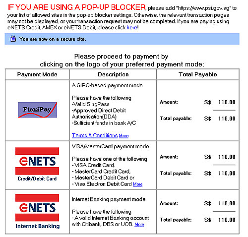
But what really puts the icing on the cake of stupidly-designed-websites is this: nothing secure is happening on this page at all. In fact, this page is full of useless information if you just want to pay your TV license. Information that isn’t required on a SECURE server and information that has absolutely nothing to do with paying a TV license. Here it is:
And this is the exact address where MDA says I should pay my TV licence.
Is there anything on this page about paying the TV licence?
In fact, there are so many links (none of which actually say PAY HERE or PLEASE ADD MONEY TO MDA’S BANK ACCOUNT), it’s not immediately clear that I need to click on MDA Online. And from the address, am I not already at MDA Online? It’s like standing under a road sign that says “Bukit Timah Road” and someone telling you “to get to Bukit Timah Road, you have to go…” You get the idea.
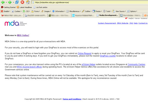
So I make an educated guess and click on MDA Online. Finally, a list of wonderful things I can do: apply for a TV licence, cancel the licence, apply for a vehicle radio licence, cancel the licence, pay for TV licence, pay for a TV licence combined with property tax and one that should be there but isn’t, apply for license to kill MDA for designing a cockamamie website.
Okay, we’re getting there, I click on the link (second click) for paying TV license and pop! There it goes. Pop up number one that although bears the MDA logo, is actually at psi.gov.sg. I don’t know what PSI stands for. And when I try to find out, psi.gov.sg gets re-directed to ecitizen.gov.sg
(A check at SGNIC shows that the domain psi.gov.sg is owned by MDA. Use the Online Whois to search, if you’re interested. So I still don’t know what PSI stands for. I decided to search on ecitizen.gov.sg to see if perhaps every site in gov.sg is registered with MDA. E-citizen is owned by MDA too, but the Administrative contact is PS Online Fund Administrator. PSI. PSO. I’m one alphabet away, but this is going nowhere and isn’t particularly interesting. But one thing does catch my attention at SGNIC. A newsflash on the home page dated 2005-09-01 – 9th January or 1st September? Does it matter? We’re on the threshold of 2007 – announcing a reduction of Domain Name Prices – still a hefty S$30 at wholesale prices. God Bless America where you can get a domain for US$7.99. Retail.)
Okay, back to bill payment.
There are three pages to this TV Licence payment pop-up window and you have to fill in more than necessary. Bill reference, amount payable (Won’t the Bill Reference give you the amount? It’s not like I can choose to pay less than what’s billed. Unless MDA wants a tip like with credit card payments at restaurants), Licensee’s ID Number (ie NRIC, FIN, Passport number, which can be cross-referenced from the Bill Reference. And why call it Licensee’s ID Number? Just put NRIC/FIN/Passport number. Everyone understands this), Licensee’s Name (which can be cross-referenced from the Bill Reference and the NRIC already asked for, but no, let’s have more typing), email address and telephone number.
It says “Please provide your contact details below so that we can contact you if we need clarifications.” Yes, with an “s”, dear MDA who’s always haranguing us about Singlish on TV.

If MDA needs to contact us, can’t they get the info from the Bill Reference Number – the bill that arrived in the mail? Everything in Singapore is linked right? By the way, the Bill Reference Number is a sequence of 16 alphabets and numbers. Let’s say I mess up on my 16 figure Bill Reference Number. Do you need my NRIC to seek “clarifications”? You only need my e-mail or phone number, isn’t it? But maybe MDA’ve never heard of RSI.
Oh by the way, the “rate this e-service” and “click here” for our contact information also pops-up a new window. There’s more forms to fill on the second page and when finally you get to put in your credit card info, you get to E-NETS and this is when the pop-ups go crazy. I think three open at one shot. Maybe some hacker will give us some fun and have one of those pop-ups go to some X rated site. It would be the talk of the town. Probably coming right behind T.T. Durai and the NKF Saga. (Don’t you just love Wikipedia?)
By the way, if you happen to hit reset when you are filling in these 3 pages, you will get an “Unable to process your request” error. This means you have to close your window, go back to MDA Online and get the form to pop-up again.
Okay, so by the time I’m paying for this bill, I’ve clicked like 7 – 8 times and have 6 new windows open on me. It’s a good thing I only have to do this once a year.
Buying stuff at Amazon requires about the same number of clicks to buy one item but it all stays on one window. Paying with Paypal on Ebay is seamless as you move from Ebay to Paypal. It stays on one window too. And there’s very little actual typing to do and I don’t have to enable / disable anything on my browser. These sites work with me, not against me.
I think government websites need to follow a few essential rules:
- provide information clearly, easily
- provide a comprehensive search function with advanced options such as a search across agencies
- all text information eg speeches, press releases to be in text, not PDF
- if PDF must be used, ensure they are fully searchable
- no essential information, including menus to be flash based
- no essential information requiring any plugin that needs to be downloaded
- any plugin that’s required should be freely available, backward compatible and internationally accepted which means that people would most likely already have them on their computer anyway
- absolutely zero pop-ups and new windows
- not render the BACK button useless
- have a consistent look, menus and navigation across all government bodies
- be compatible with old browsers at least 2 generations back
I think that government websites should cater for the mass, and should allow for people who don’t have the most cutting edge technology to access websites.
Furthermore, a consistent look across every government agency makes people feel comfortable and get an idea of where they can find the information even if they move from website to website of different agencies. A consistent look doesn’t mean the designs can’t be different.
The Internet is primarily about information. If we hide this all under a messy structure, it’s as good as not having them on the Internet because it can’t be found. Instead of dealing with bureaucracy, we now have to deal with a structural mess. And that’s worse than bureaucracy because at least then there’s someone to yell at and to ask to see the boss of.
Let’s take the IRAS tax website, for example. I’ve been filing taxes online for at least 3 years now. The first two years, the look and menu layout were pretty much the same. Not pretty but at least easy to use. The first year there was a small learning curve. But the second year, I knew what to do because I was already acquainted with the form. But this years’? It was horrid. Too many buttons to press before you got to the actual form. It was a whole new interface. Form hidden behind forms everywhere. It was an utter mess.
The CPF website has gone from bad to worse in terms of useability. Windows lead to more windows. It’s hard to find your way back.
It’s good that we have a government that has all these e-services. It’s hell of an achievement. But I think more time should be spent making things clearer, easier to use, easier to find. I think studies need to be made on how to make these government websites useable.
It’s hard. I mean you have to cater to those who are web savvy as well as to those who aren’t.
But I think it is a worthwhile investment to make. Because a well designed, useable website can grow and last. Even if the design may not look contemporary in ten years, if it is user friendly and information can be easily found, people will still use it. Look at Google. It looks like Yahoo! ten years ago. Do you still Yahoo! ? I don’t. I Google.
Structure and function outlasts design. Structure is hard to get right. But when it is right, the design can be easily modified and changed, like a wrapper over a present. Get the gift right, does it matter if it’s not wrapped? (Sorry, it’s still Christmas.)
Come on, we have an efficient government. (A voice in my head says we do. God? PAP indoctrination?) Why can’t our government websites be efficient too?